
Brains On
Student Work
Medium: Frame by frame animation
Timeline: ~2 weeks
Brain’s On is an award-winning science podcast that reached out to my advanced motion graphics class for help with a new project. We were tasked with animating short segments of their show where kids call in and respond to a question. In the show, the kid’s audio responses are cut together and featured in each themed episode. I chose the clip from the episode Animal Farts: The Mighty Wind so I could make kids’ ideas of animal farts come to life. My concept centered around transitions, with each fart filling the screen and the next animal's introduction somehow wiping the slate clean for the next fart to begin. I went for a more messy and imperfect illustration style and a limited color palette in order to challenge myself, and give the bright green farts center stage. I don’t normally inject humor into my work so the best part of this project was to watch everyone smile and laugh as they watched.
Lee Jameson
Freelance with Studio HMVD
MediuM: Type design
Timeline: 3 days
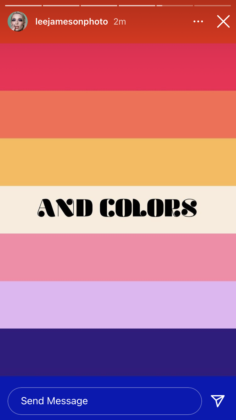
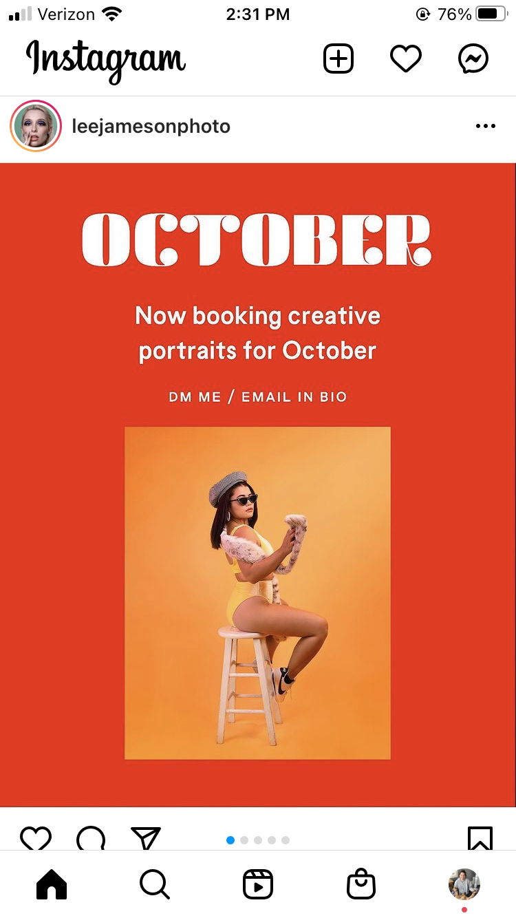
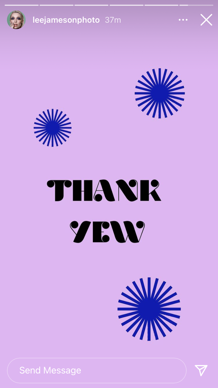
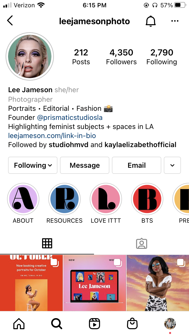
This was a custom brand typeface designed in collaboration with Studio HMVD for their client Lee Jameson, an LA-based photographer. When they reached out to me they were in the middle of building the brand, had designed a custom “LJ” mark, and needed help developing it into a full display face. The intentional was to reflect the qualities of Lee’s work and the brand, bold, high-contrast, and playful. They supplied a few letters as a starting point and I stuck with some, evolved others, and developed new characters. I’ve included the full character set as well as some examples of the type in use by the client.

Alter Eco Foods
Interning with Modern Species
Medium: Packaging
Timeline: ~1 week
This was my favorite project as an intern at Modern Species. The grass-fed collection was a new product line for Alter Eco. With an imminent rebrand, they needed some mock packaging quickly developed so they could sell the products to grocery stores before the new brand launched. The brief was pretty light apart from aligning with the existing packaging and suggestions of a bucket and “clump of grass.” I knew the intention with these suggestions to try and evoke a farm-to-table vibe, but I felt a bucket brought to mind farms and udders more than fresh milk and sweet cows. So instead I opted for a glass bottle, reminiscent of a milkman delivering milk to your doorstep and light airy grass to bring to mind cows peacefully grazing in the field. I also swapped out the brand’s topography line background with cow spots and leveraged a more neutral palette to highlight the “grass-fed milk” feature and differentiate the line from their other, more vibrant, products. I only found out after the internship that the project was so celebrated it went into production, was stocked on the shelves, and the product ended up being a new best-seller for the brand.